An Illustrated History of Mega Man Box Art
In March of 2012, Capcom launched Street Fighter X Tekken, a fighting game that pitted Capcom’s own Street Fighter characters against Namco Bandai’s Tekken characters. To top it off, Pac-Man joined the battle to represent Namco’s greater universe, and Mega Man showed up to support Capcom.
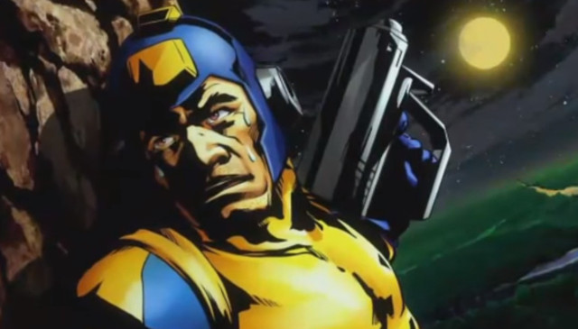
But it wasn’t the classic Mega Man we all knew and loved; it was this guy:
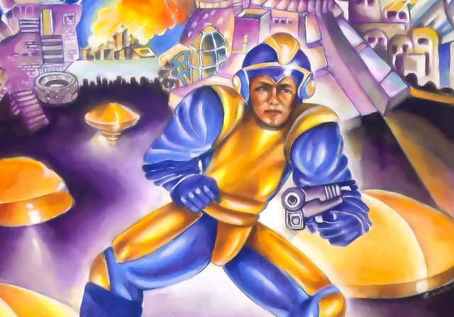
This character was officially dubbed “Bad Box Art Mega Man” and was a reference to the cover art for the original Mega Man game. Yes, on the original box art, Mega Man dressed in yellow and carried a pistol instead of having a blaster built into his arm.
One must wonder, had the person who created this ever actually played Mega Man? And how had Capcom allowed this to be the image that represented the North American launch this new IP (an IP that would go on to revolutionize the platformer and be beloved by millions)?
Of course, Mega Man would continue to grow as a series, and the box art got better through the years. We’ve sifted through several decades of Mega Man boxes to illustrate this evolution. (All of our covers are North American versions, which in most cases were much different than their Japanese counterparts, and were sometimes also different than European versions.)
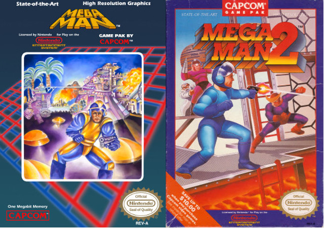
In the 1980s, Capcom launched the first two games in the franchise, Mega Man in 1987 and Mega Man 2 in 1988. The original box art is just all sorts of wrong. The second is much better, actually referencing imagery from the game (including the drill-armed Crash Man and the boomerang-foreheaded Quick Man), but there are still some problematic elements to it. Why is Mega Man’s body so curvy? Why is he still holding a gun? (We actually have sort of an answer to that second question.)
And wait, is Mega Man left-handed? It would appear so, as he’s holding his gun in his left hand in both of the above images.
Now, the 1980s weren’t exactly known for having brilliant box art (the original box art for Super Mario Bros. shows Mario dying as he falls into a lava pit after all), so expectations were certainly much lower than they are today. The original game didn’t meet sales expectations, however, and longtime Mega Man producer Keiji Inafune is said to have blamed the less-than-ideal U.S. sales on the bad box art. And perhaps he’s not wrong. It’s quite off-putting, after all.
When the 1990s rolled around, the box art continued to improve.
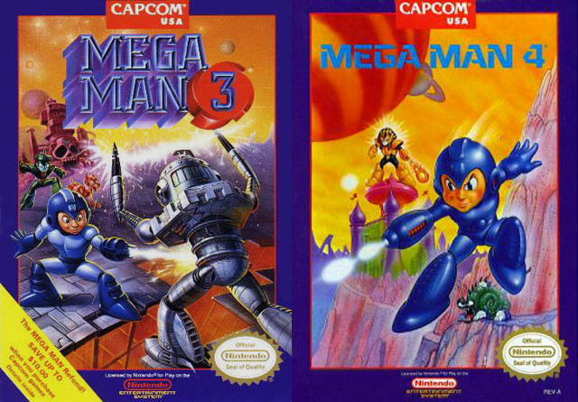
Mega Man 3 launched in 1990 and Mega Man 4 in 1991. You can see Mega Man (the character) getting more cartoony and less creepy, and he’s actually using his Mega Buster (or Arm Cannon), though it’s getting less clear whether he’s a lefty or a righty. Mega Man 3‘s box art actually features bosses from the game (Spark Man and Top Man), and it even includes Dr. Wily’s castle as it appears in the games.
Mega Man 4 shoots for a more simplistic approach, though it does still show off Pharaoh Man from the actual game, as well as what appears to be the Escaroo miniboss (which, incidentally, is weak to Pharaoh Man’s Pharaoh Shot weapon).
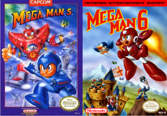
Mega Man 5 came out in 1992, and Mega Man 6 came out in 1993, meaning there was a new Mega Man game released every year for four straight years. (In Japan, that is. Mega Man 6 was held back from North American release until 1994.)
While Mega Man 5‘s box art is a bit sloppy, Mega Man 6 takes a huge leap in production quality. Of course, they still couldn’t seem to decide how the Mega Buster was supposed to work, as it’s back on his left arm in 5 and completely missing in 6. You could argue that this is a depiction of Mega Man wearing both the Rush Jet Adapter (which allows him to fly) and the Rush Power Adapter (which allows him to punch through barricades) at the same time. While he’s not allowed to wear both at once in the actual game, this theory does explain his red coloration, his jetpack, and his fists.
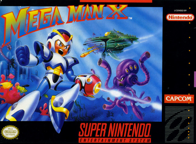
In 1993, Mega Man also made his way to the Super Nintendo Entertainment System with a brand new sub-franchise, Mega Man X. It’s a re-branding of sorts, and this is where you start to see the more anime-inspired look represented on the box art.
X seems to be a lefty as well.
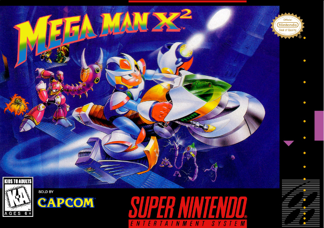
1994 saw the release of Mega Man X2, which continued the higher-quality, anime-inspired trend. It’s also the first box to include an ESRB rating, back before the “E for Everyone” rating would replace “K-A” (or “Kids to Adults”).
Also, we have the Mega Buster on the left arm once again.
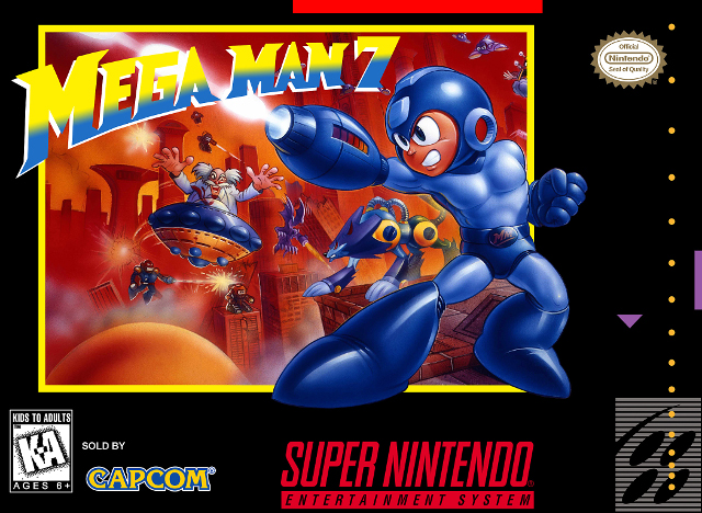
In 1995 (March in Japan, September in North America, and November in Europe), the mainline franchise finally made its way to the SNES with Mega Man 7. Interestingly enough, the box art goes back to that sort of cartoony look of Mega Man 3-6 instead of keeping in line with the other SNES Mega Man titles. Perhaps Capcom wanted to emphasize that these were two separate franchises, and that the anime look was saved for the X series (and most of the post-X sub-series).
The Mega Buster is back on Mega Man’s right arm, though.
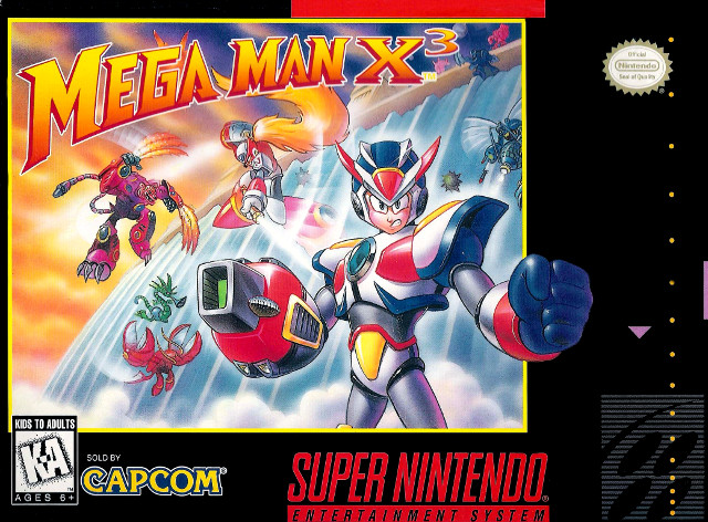
1995 would also see a new game in the X series, Mega Man X3 for SNES. Interestingly, its artwork was a little bit more sloppy than previous covers, and it seems like the artist was going for a sort of Dragon Ball look. Or perhaps it was an attempt at emulating the Chrono Trigger style, which was also the work of Akira Toriyama. (Chrono Trigger was released earlier that same year.)
We’ve also got Zero on the box art, though not in a prominent position.
It seems Capcom has decided to keep using the right-handed Mega Buster as well.
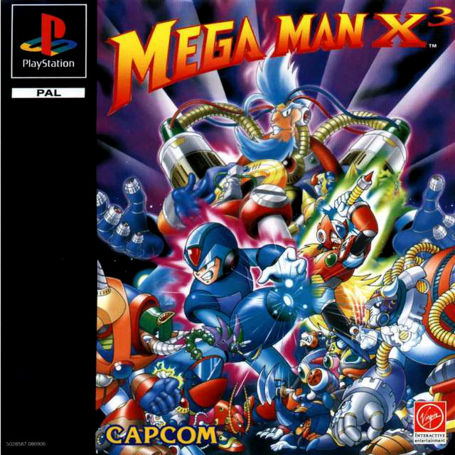
Mega Man X3 would also be released on the original PlayStation, with a far more detailed cover depicting a huge array of characters from the game. It’s almost overwhelming to look at, but Zero seems to have gotten another promotion in box art positioning, with an action pose directly behind X.
The Mega Buster, of course, is on the right arm yet again.
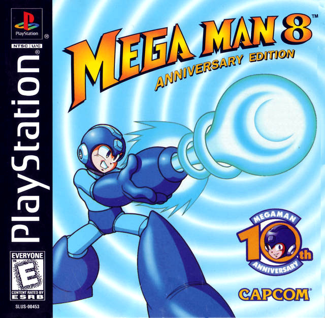
In December of 1996, Mega Man 8 came out for the PlayStation in Japan. It wasn’t released in Europe and North America until 1997, so a special 10th Anniversary Edition was created. Here you see the mainline Mega Man franchise finally adopting “the X look” on its box art.
But wait, what is this? We’re going back to the left arm for the Mega Buster now.
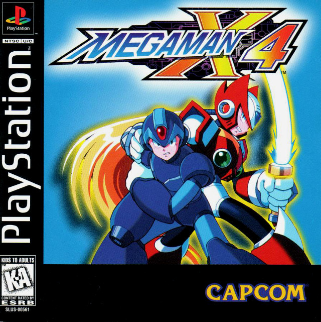
Mega Man X4 arrived in August of 1997, transforming Mega Man (two words) to Megaman (one word) and keeping with the simple light blue background of Mega Man 8. Zero is still behind X, but he’s clearly earning his place as a major character by this point (by box art standards, anyway; for fans, he’d been a major character in the games since the first Mega Man X).
X is back to being a righty.
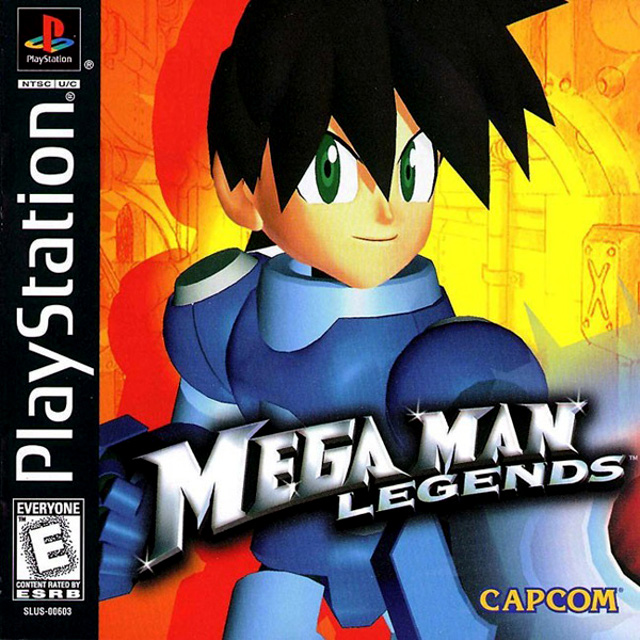
Yet another sub-series would be released at the tail end of 1997: Mega Man Legends. This cover is designed to illustrate the transition to 3D, with a very polygonal-looking character against a possibly hand-drawn backdrop. Mega Man is back to two words, as it should have always been.
A new protagonist, Mega Man Volnutt, is introduced for this far-future tale, and he happens to be a lefty. He’s also not wearing a helmet, so we finally get to see Mega Man’s (or Mega Man Volnutt’s) hair color illustrated on a game box.
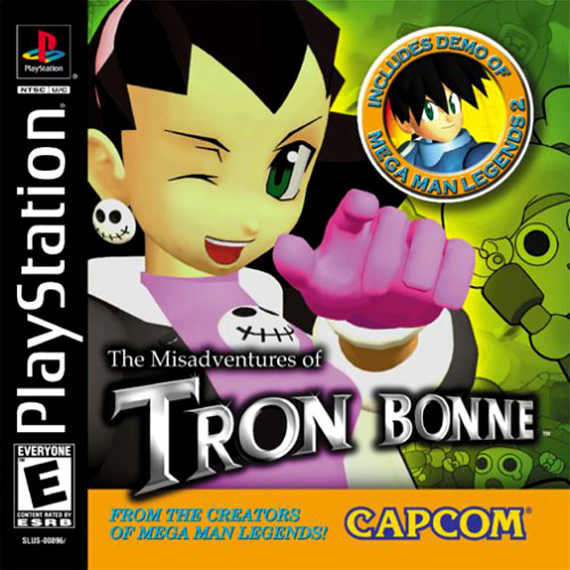
The Mega Man Legends series would overtake the franchise for a while, with a prequel, The Misadventures of Tron Bonne, released in 1999 in Japan, and 2000 in North America and Europe. It features a very similar faux-3D look to that of Mega Man Legends. Apparently, the game also included a demo for Mega Man Legends 2.
Also, is Miss Bonne a lefty? She’s pointing with her left hand, but that doesn’t necessarily mean she’s left-handed.
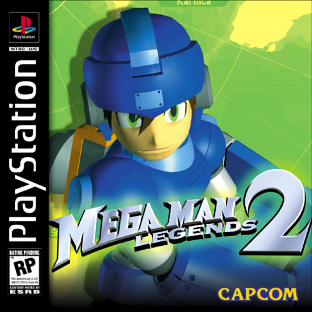
The Misadventures of Tron Bonne was followed by Mega Man Legends 2 (April of 2000 in Japan, October of 2000 in North America, and August of 2001 in Europe), which took a huge step backward in the cover art department. In fact, Mega Man Vonutt looks downright creepy here. We also can’t tell if he’s left-handed or right-handed here due his pose and the positioning of the letters. While he’s forsaken the helmet-less look, Volnutt’s hair can still be seen, and it’s lighter than it was on the original Mega Man Legends cover.
Sadly, this would be the last game in the Mega Man Legends sub-series. Keiji Inafune attempted to revise it with Mega Man Legends 3 for the 3DS, but this game was cancelled in 2011 following Inafune’s 2010 departure from Capcom.
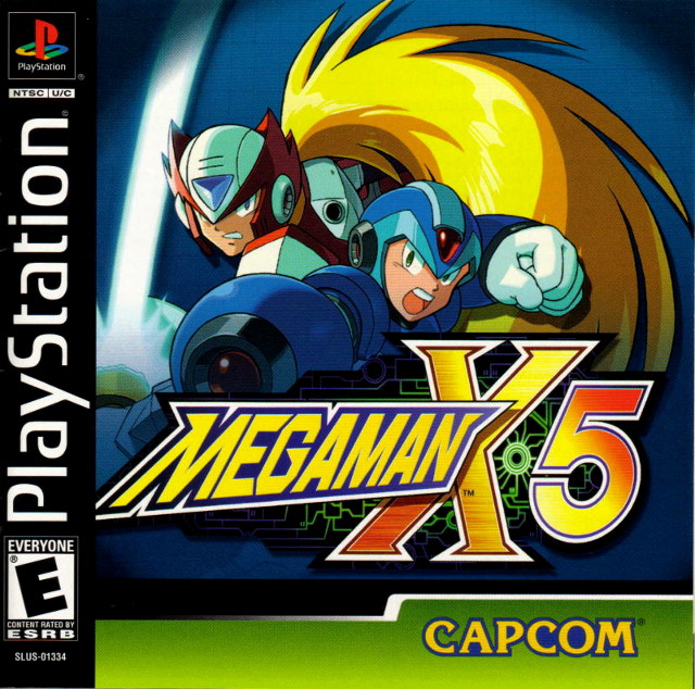
Right on the heels of Mega Man Legends 2 was Mega Man X5 (November of 2000 in Japan, January of 2001 in North America, and August of 2001 in Europe). The return of the X series came with the return of one-word Megaman, the anime art style, and Zero in a prominent position on the cover.
Also, X is wielding the Mega Buster on his right arm here.
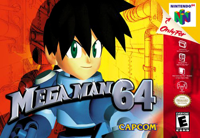
At just about the same time (November 2000 in Japan and January 2001 in North America), Mega Man Legends finally made it over to the Nintendo 64 under the title Mega Man 64. The cover is fairly unremarkable, as it’s just a cropped version of the Mega Man Legends cover.
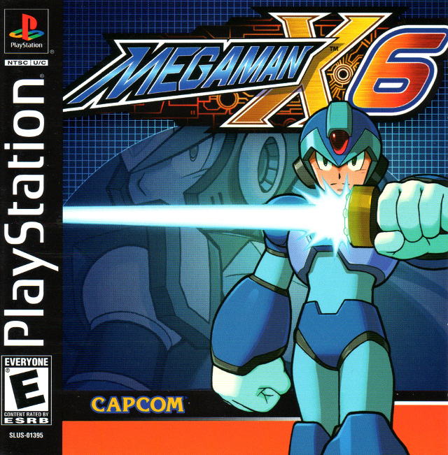
Mega Man X6 arrived in November of 2001 in Japan, December of 2001 in North America, and February of 2002 in Europe. The cover is fairly standard for an X cover, with the anime art style and the one-word “Megaman.” It’s interesting to point out, however, that X has no Mega Buster and is holding a Z-Saber, and that Zero has taken a less prominent position; he’s larger than X, but he’s sort of looming in the shadows in the background.
If the Z-Saber is any indication, X is left-handed here.
In 2003, North Americans and Europeans were finally treated to Mega Man & Bass, which had released on the Super Famicom back in 1998 as sort of an unofficial Mega Man 9. Yes, you read that correctly: it launched on the Super Famicom several years into the PlayStation’s lifespan. It landed on the Game Boy Advance as a re-release in Japan in 2002, and it made its way to North America and Europe the following year.
The art style is close to that of the X series and Mega Man 8, it used the one-word “Megaman” stylings of the latter X games, and it was given a special 15th Anniversary symbol on the box.
Oh, and it’s a right-handed Mega Buster.
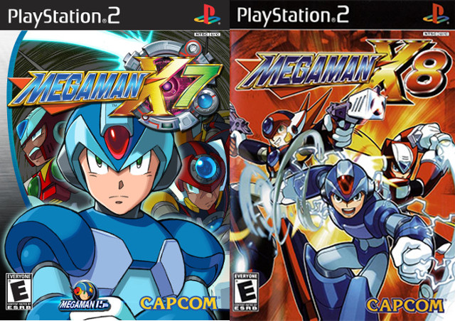
While there’s very little evolution at this point, we’ll wrap up the X series with a quick look at Mega Man X7 and Mega Man X8, both of which landed on the PS2. They both feature the one-word “Megaman,” as well as right-handed Mega Busters. Mega Man X7 also features the 15th Anniversary graphic, as it came out in 2003 in both Japan and North America. Europe would have to wait until 2004.
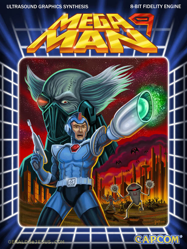
While there are several spinoff series left uncovered (pun intended?) in this article, the box art doesn’t really get interesting again until 2008 with the launch of Mega Man 9. This is where the series went back to the 8-bit roots of the original NES titles, and this is where the box art got weird again.
The joke was that this was a digital release, so there was no actual game box necessary (though Capcom did a special edition that came with a physical box and a replica NES cartridge). It’s an homage to the original North American box art, and, while it’s completely ridiculous, it’s not as bad as the original. You’ve also got a Mega Buster on the left arm, and a gun in the right hand (which seems a bit redundant). It’s a great parody that captures the spirit of the original and revels in its absurdity, and the truest of Mega Man fans were going to be in on the joke.
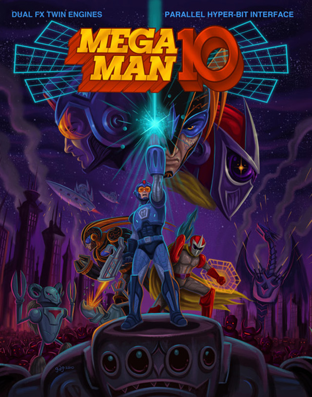
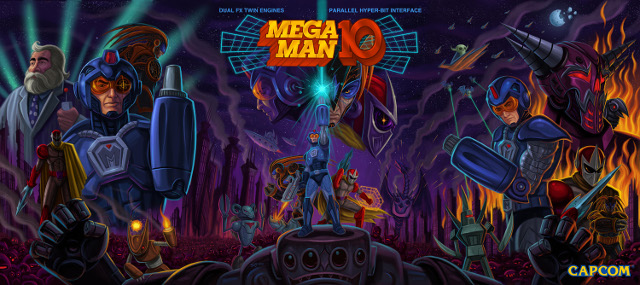
Capcom did it one more time in 2010 with the 8-bit release of Mega Man 10.
Yes, it’s glorious, and it’s only 1/3 of the full image, which Capcom has blessed the world with.
Unfortunately, that would be the final game in the mainline Mega Man series for a while, as well as the end of the parody game boxes. 2010 was also the year Keiji Inafune left Capcom, and by 2011, every Mega Man project in production at the time (Mega Man Legends 3, Mega Man Universe, Rockman Online, and the then-secret Maverick Hunter) would be cancelled.
It’s nice to see, though, that in the very end, the series gained a sort of self-awareness that it had perhaps lacked throughout its history. It was finally okay for the Mega Man franchise to admit it had grown completely absurd, spawning so many sequels and sub-series that it was almost impossible to keep track of.
For fans, though, that was almost certainly part of the charm.
Of course, well after this article was initially published, Capcom went ahead and released Mega Man 11. Here’s the art:
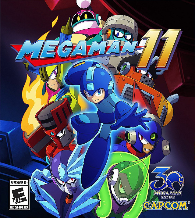
And he’s a righty.


The PS2 ones are the best looking to me.
Aw man, this was awesome. So much megaman, so much misguided artwork.
Finding this article many years later, after beating mega man 1 with my 12 year old son and laughing about the cover art. Great article, ty
Thanks for the comment!
I love that parents are sharing these golden oldies with another generation of gamers!
Mega is ambidextrous, mentioned in the comics; the mega buster can manifest on either hand, based on what he’s doing otherwise. It’s even shown in the original concept art as being able to retract the hand into it.
Rock is right-handed; Mega is ambidextrous.
Interesting that they kept the left/right so balanced in the box arts, though. I know there was a stickler-for-consistency vibe that was inconsistently applied, but I didn’t know it was here one the box art~
You missed Mega Man The Wily Wars from Genesis
I feel like that one doesn’t count…