The Strange and Wonderful World of Atari Box Art
In the age of Atari, games couldn’t sell themselves on graphics alone. Games needed ways to spark players imaginations, to convince them that their villains and heroes were more than awkward clumps of pixels.
And for that, they relied on box art.
While some video game companies gave little thought to their cover art, Atari made it a priority. “I felt fundamentally that this was a consumer product that needed all the care and attention that a record album did,” explained Atari’s founder, Nolan Bushnell. “I wanted the artwork to have a consistency to it, so that immediately, when you glanced at our packaging, you knew it came from Atari and you knew it was beautiful.”
One of the first artists Atari partnered with was Cliff Spohn, a commercial artist with a distinct detailed style. Spohn was hired to create a cover Combat and Surround, two of Atari’s launch titles. The work he did was striking, and it quickly defined the Atari aesthetic.
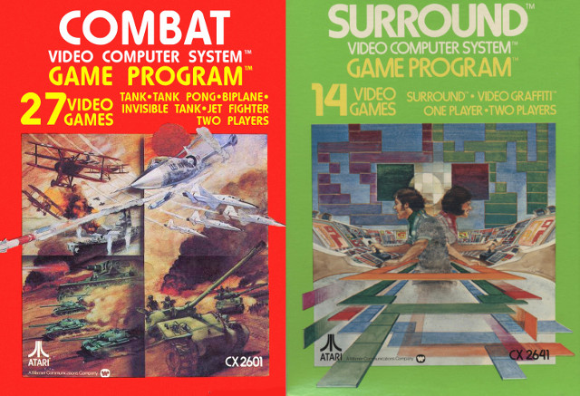
Spohn appreciated the unique challenge that cover art provided, comparing it to “building a puzzle.” “The little icons on the screen were so abstract so the kids that were playing it would be picturing submarines and battleships and airplanes and all of that kind of stuff,” Spohn said. “My covers kind of fired up that imagination.”
Atari soon began to seek out artists that could emulate Spohn’s style. “I would get this call from an illustrator,” Spohn recounted. “They’d ask me all of these questions like how did I make this wash or what was I thinking with a specific image. The next thing I knew there were all of these little Cliff clones.”
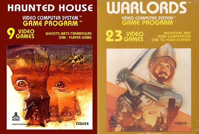
One of those “Cliff clones” was Steve Hendrickson, who created covers for games like Haunted House and Warlords. While you can see hints of Spohn’s detailed montage style in Hendrickson’s work, his covers placed more of a focus on human faces. In fact, Hendrickson claims to have used fellow Atari illustrator Jim Kelly as a model for several of his covers. “He was a great model and illustrator,” Hendrickson said.
When Hendrickson started working with Atari, he knew almost nothing about video games. Thankfully, Atari gave its artists plenty of creative freedom. “I would get a list of all the new game titles and then I would divide up the illustrations among our internal staff of illustrators and many freelance illustrators. So I would work on the titles I thought would be fun to work on,” Hendrickson recounted. “We approached each new cover as if it were a paperback book cover.”
Many of Atari’s artists, such as Susan Jaekel, had a great deal of experience with book covers. Jaekel primarily worked as an illustrator of children’s books, and had also created covered for a number of textbooks before working with Atari. “With textbook illustrations, you’re given a real specific assignment,” Jaekel said. “These were so much larger, with exciting subject matter, and it was really fun.”
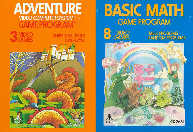
Although Jaekel created the cover for Adventure, one of the Atari’s most beloved titles, she has never tried it for herself. “I never played the games, I was totally clueless about that,” she explained. Still, Jaekel has received a great deal of positive feedback from fans of the game. “I’ve had several emails and phone calls over the years, and it’s usually people who played it.”
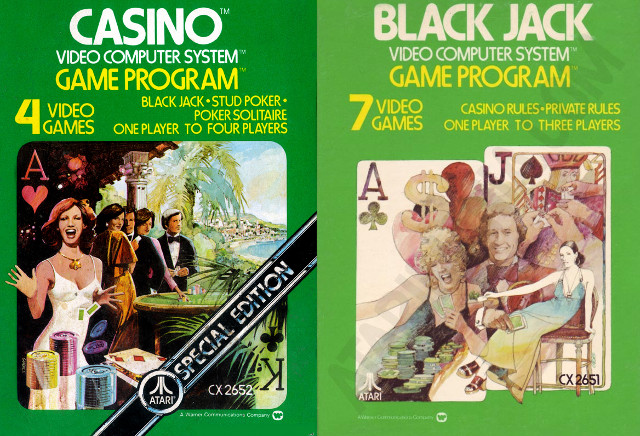
As Atari’s popularity grew, they began to seek out more prominent artists. Among them was Rick Guidice, who had worked with NASA in the 70s to create images of space colonies. Although Guidice’s background made him the perfect fit for sci-fi games, he primarily created covers for gambling-themed games, including the infamously deceptive Casino.
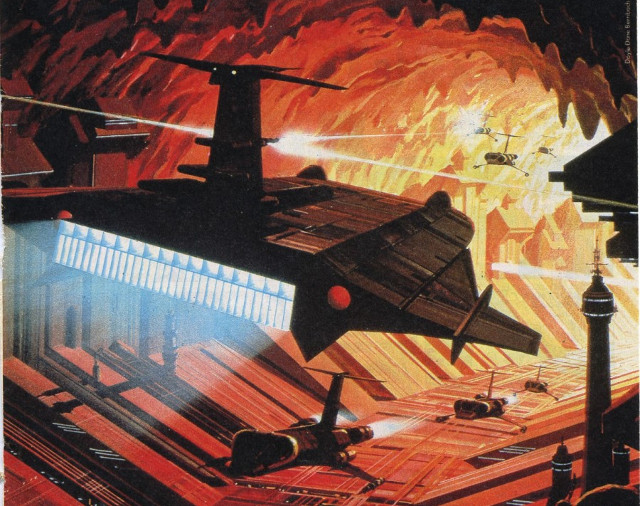
Atari even hired Star Wars concept artist Ralph McQuarrie to paint a single Atari cover. His painting, which appeared on the box art for Vanguard, was featured prominently in Atari advertisements.
In today’s world, few cover artists have the level of freedom that Atari’s artists did. Game covers are usually selected by a marketing apartment, and their style tends to change as trends do. “People are afraid of the different. They want to do more like what they did last year that was successful,” says Nolan Bushnell. Still, he believes that the artwork he commissioned for Atari looks as good now as it did decades ago. “It was consistent. It was sophisticated. I think that good stuff stands the test of time.”
Mandi Odoerfer
I like to write about stuff and yell at the moon. I think I might be twelve. I'm probably not Daredevil. Probably.
I’ve always thought that this era had the best box art, though I’ll admit I’m quite biased. I used to save my game boxes and store them in another box. I really enjoyed hearing the stories behind some of these boxes. I appeciate some true retro content.
Here’s a funny thing though. This is the cover for the Jack Vance novel To Live Forever, published 1978 by Sphere Science Fiction. The similarites to Atari’s box art style are as you can see very obvious. Did Cliff Spohn or someone at Atari own a copy of this book and straight up yoinked the entire design?
That’s a great find. I’m trying to pinpoint the exact date Atari switched from those old gray boxes to the design shown above to see who ripped off whom.
Also, I run another site that you might be into called Retro Book Covers, haha.
https://retrobookcovers.com/
This is something I should investigate on behalf of both Retrovolve and Retro Book Covers.
I’d been looking for information about this great artwork and your article hit the spot! It led me to other resources as well, and the great book about Atari art by Tim Lapetino. Just a note though, you mention Steve Hendrickson, but his name is actually Steve Hendricks.