Visually, Metal Gear Solid Has Aged Really Well
During the PlayStation/N64 era, technology was evolving rapidly, constantly pushing video games into exciting new territory. This was the rise of polygons, of three-dimensional, explorable landscapes. This was when Resident Evil was born and when Link first rode Epona across the wide open fields of Hyrule.
This, however, was not an era known for its beautiful visual quality.
Time has been absolutely brutal to the graphics of games of PSOne games. In fact, of all the generations of gaming, it’s the PSOne/N64’s that has aged the absolute worst aesthetically. The 8-bit and 16-bit eras circumvented this problem by crafting highly stylized, colorful, cartoony visuals built from pixels, whereas far too many PSOne games aimed for a “hyper-realistic” look — a look that simply couldn’t be pulled off with limited technology.
It’s hard to blame 1990s developers for this; the polygon counts they were working with were frustratingly low, as were the texture resolutions available to them.
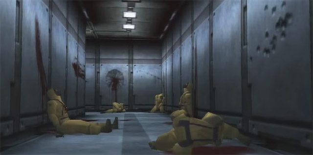
The creative team at Konami, however, showed an unusual amount of foresight while developing Metal Gear Solid. They took what little they had and used that to build an aesthetic that worked. I mean, look at this screenshot (admittedly from the PC version of the game):
This looks good, right? And not just in a “looks good for the time period” sort of way; the above image is, for the most part, visually appealing to this day.
This is a look that doesn’t fight against the PSOne’s limitations; it embraces them. It dulls the color palette by using a lot of greens and greys. It puts enemies into bulky suits that require fewer polygons. It uses a lot of straight lines and 90-degree angles to reduce the complexity of the environment. On top of this, the camera angles are interesting enough that, even when the proverbial seams are clearly visible, the scene doesn’t end up looking awful as a result.
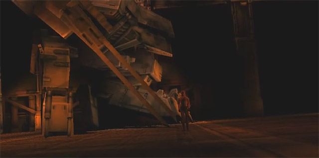
Here’s another example:
There’s a distinct reddish brown wash that reduces the color count considerably, preserving precious resources for things like the detailing on the badass Metal Gear REX in the background. Again, we have a lot of straight lines and an interesting camera angle that adds some extra pizzazz.
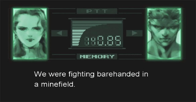
Even the codec interface, which you’ll spend absurd amounts of time staring at, is done with a stylistic flare. Note the low-pixel font and the artistic sketches of character faces as opposed to full 3D representations:
In the context of the game, this works really well. (In fact, I would argue that Metal Gear Solid 2‘s codec interface, which uses 3D faces that are fully animated, is far less visually appealing than the original’s.)
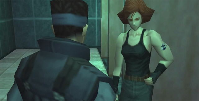
I’ll admit that Metal Gear Solid‘s aesthetic falls apart a little whenever it’s focusing on characters specifically. But at least Konami worked really hard to add tiny little details where they could, like Meryl’s tattoo.
And wait, didn’t they actually detail her nipples as well?
Why yes. Yes, they did.
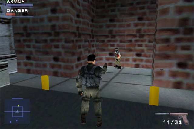
Now, for a comparison, here’s a screenshot from another stealth-heavy PlayStation game, Syphon Filter:
Here, we have textures that attempt to be overly complex, so they end up being distorted to ridiculous levels — just look at the pouches on Gabe’s backpack. The humans look hideously warped and jagged, and, since no one has a shadow, it appears they are just sort of floating about rather than standing on the concrete. To top it all off, the color palette is splattered all over the place without caution or remorse. In attempting to replicate scenes from the real world on limited hardware, the designers had to twist everything until it pretty much broke.
Now, keep in mind that Syphon Filter came out several months after Metal Gear Solid. It wasn’t a fluke that happened early in the console’s lifespan; this was just what a majority of PSOne games looked like.
I have a hard time returning to a lot of my favorite PSOne games — despite the fact that it’s probably my favorite console of all time — because I remember these games looking far better than they actually did. It’s kind of depressing to pick up something like Syphon Filter (which I genuinely loved back in the 1990s) and find out how terrible it actually looks now.
But Metal Gear Solid succeeds where far too many of its peers fail. Its visual design simply worked, despite all the limitations placed on Konami’s development team.
And that, to me, is a pretty gigantic accomplishment.
Update: As commenters pointed out below, I grabbed my screencaps for this particular article from the PC version, which has better quality visuals than the original PSOne version. However, I believe all of my points still stand, and the graphical look is more about style than about quality. Having played the PSN version of the original recently, I’ll confirm that the visuals, while a bit more jagged in the original, still hold up much better than a huge chunk of the other games from this time period.

Great article! Final Fantasy 8 & Legend of Dragoon are also incredible looking games. Fear Effect 2 and C12 Resistance as well. If you want to see the best representation of Metal Gear Solid on PSX YouTube search Metal Gear Solid Platanogames, I adjusted the ratios for gameplay and cutscenes to have a more modern HD look! Some moments look unbelievable!
Those are PC screen grabs.
http://i.ytimg.com/vi/xFA5Zm3Ltqw/hqdefault.jpg
You’re correct. I screencapped from the PC version because it was a lot easier than recording PS3 or PSOne footage and screencapping that. I’m currently replaying it on PS3, and, while the graphical quality is a bit more jagged, it’s really not as bad as a bunch of the other PSOne games I’ve played recently. Especially Syphon Filter.
I’ll update the article to make this more clear. Thanks for the comment!